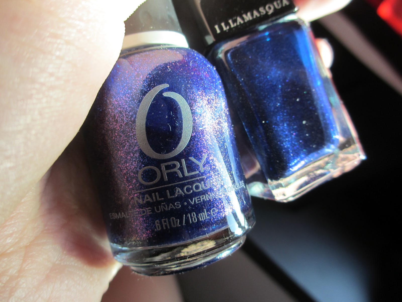
Illamasqua - Phallic
Orly - Lunar Eclipse (ring finger)
Surprise! Double post today.
I was too excited to used Phallic and since removing my glitters took me longer than expected, this will be a short comparison post. Pictured here is two coats of Phallic and on my ring finger only, three coats of Lunar Eclipse.
Phallic is a blackened blue (quite like Lady Sings The Blues) creamy shimmer polish. It contains lots of shimmer which flashes silver, blue, a little green and pink to my eye (well only when I hold the bottle up to the sun; it's too deep and brooding on the nail from afar).
Lunar Eclipse is an electric blue duochrome shimmer which flashes deep purple from extreme angles. It's part of the Orly Mineral FX collection which you know I'm absolutely nuts about! It was my least favourite in the collection though, as the duochrome shift is the most subtle compared to the rest of the Mineral FX shades. Well at least I can compare it with Phallic.
Lunar Eclipse is an electric blue duochrome shimmer which flashes deep purple from extreme angles. It's part of the Orly Mineral FX collection which you know I'm absolutely nuts about! It was my least favourite in the collection though, as the duochrome shift is the most subtle compared to the rest of the Mineral FX shades. Well at least I can compare it with Phallic.
Basically they looked pretty similar in their bottles - except the obvious difference that Lunar Eclipse contains duochrome shimmer and sometimes flashes deep purple. I don't really know how to describe this completely and my digicam was unable to capture this in all my twenty attempts of trying... Well if you look closely at the first picture below, the left half of my ring finger is flashing a little bit of purple. Intensify that five times more and you get the idea... yes.
The pictures don't reveal this but Lunar Eclipse is a couple shades lighter than Phallic. Also, the shimmer in Lunar Eclipse make it look lighter as it reflects more light; the shimmers pop. Meanwhile, Phallic contains a more subtle mix which sits and shimmers within the blackened blue base, resulting in a more complex and deep look. Very sophisticated.
The pictures don't reveal this but Lunar Eclipse is a couple shades lighter than Phallic. Also, the shimmer in Lunar Eclipse make it look lighter as it reflects more light; the shimmers pop. Meanwhile, Phallic contains a more subtle mix which sits and shimmers within the blackened blue base, resulting in a more complex and deep look. Very sophisticated.
Alright, dry time was good on both. It would be nice if Phallic dried a tad bit quicker though. But then again Phallic was amazingly pigmented and dried so stunningly on the nail, the dry time doesn't even matter! Lunar Eclipse dried faster but it's also because it ran rather sheer, hence the three coats.
And! It has been proven - Illamasqua's formula is unrivaled. Perhaps only Deborah Lippmann can compare. Application was a dream... my goodness it was amazing. It's self-levelling too - I messed up my thumb and had to paint an extra coat over and top it again with Seche. It made those horrid wrinkles at first but two minutes later they were gone - AMAZING. Phallic also has such an affinity with Seche - no issues with frosty tips despite the huge dollop of topcoat I applied on each nail. LOVE ITTT!!!
The only gripe I have with Illamasqua is the square bottle tops... it makes it hard to paint.
I'm also not looking forward to the post-removal staining... but then again, which beautiful blue polish doesn't stain?
WELL, Sephora needs to bring Illamasqua to Singapore. PLEASE!??
I'm also not looking forward to the post-removal staining... but then again, which beautiful blue polish doesn't stain?
WELL, Sephora needs to bring Illamasqua to Singapore. PLEASE!??
Enjoy the pix!
x, Ish