Monday, January 14, 2013

what i've been doing lately

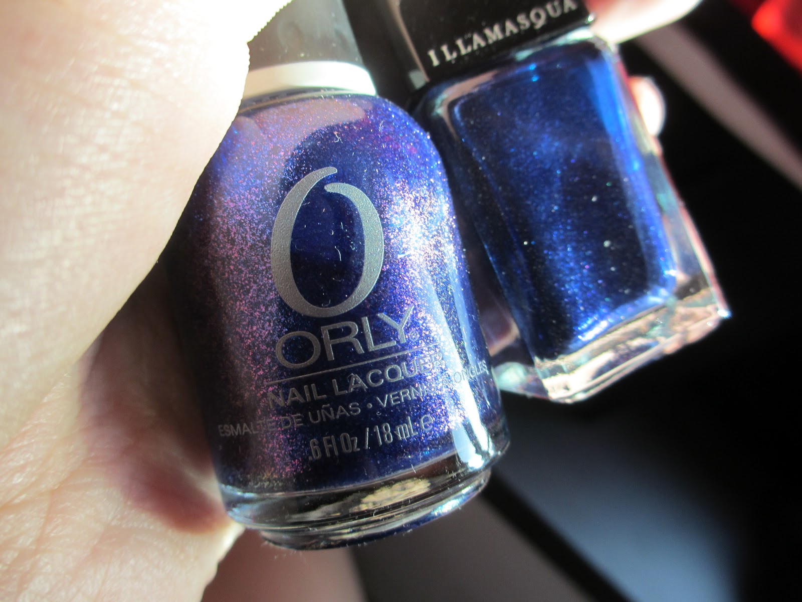
Hello! My camera has been with a friend all week and hence I can't upload any nice macro shots of my nails.

Here are some screenshots of my Instagram hahaha so at least you know I've been painting (though admittedly, not as often as I would like to be).  Well, the holidays seriously flew past.

Follow me on Instagram @IshieFishiee!


China Glaze - Unpredictable

Instant gradient nails for me! Love duochromes and absolutely love China Glaze for creating their Bohemian line of duochrome polishes!!! <3 They turn out slightly streaky (as do all metallic frost-finish polishes) so remember to paint as straight as possible right down the length of the nail, so at least the streaks are neat and straight! I think you should be able to see them in the image above. Dry time is alright, I gave myself a good hour before topcoat (I feared Seche frosting at the tips) and even so, only a very very thin layer of Seche. It would help if you put on a movie or TV show during dry time. Loved this look so much. Good wear too. So much love for CG right now.


OPI - Dulce de Leche
OPI - Alpine Snow

You HAVE to know how difficult it is to DIY a Classic French. Yeah there are those French tip sticker guides that help you create that perfect straight-as-an-arrow line. Unfortunately, my manicare brand french tip guides adhered too much to my polish, despite my Dulce de Leche base being left to dry for a good 20 minutes - the stickers were just too damn sticky. They ended up ripping out part of my polish. Hence you can see some imprefect straight lines and other wonky ones I just free-handed on the rest of the nails I didn't use the sticker guides on. Well I won't ever DIY the Classic French ever again. I'll probably create glitter French tips or something, but I'll leave the Classic to the professionals :-) The skills required to create the perfect Classic French is worth your $$$$$.


Cult Nails - Clairvoyant 
OPI - OPI Ink (Used as a base for Clairvoyant for pigmentation. More on the look here.)
OPI - Just Spotted The Lizard (Chevron outline)

Chevron nails! I LOVE CHEVRON. I once did a Chevron-tip design before with OPI's Jade Is The New Black, a plain black creme and OPI's Designer de Better! as the Chevron outline. It made me look like I was a very patriotic Rafflesian. This design shown here was meant to be more of a Chevron half-moon instead of the tip, but I obviously painted the purple V's too far out from my cuticles. What to do... the Clairvoyant was too pretty! Had to show more of its flakie beauty, yes? To create the V lines, I used 3M Magic Tape.  Before cutting them and using strips to create the clean V shapes, I pasted the tape pieces all over my skin so the strips wouldn't be overwhelmingly sticky, unlike those nasty manicare strips! By the way I created the V outline with Just Spotted The Lizard as an afterthought, because my initial idea of the purple and black combination still lacked that... little extra. So I free-handed the duochrome V's with a toothpick. Not too shabby, eh? Also, I'd chosen a duochrome so it would add that extra flashiness to a generally subtle manicure. What do you think of it? :-)

Well so I'm painting my nails again tomorrow! So excited. What colour should I use? :-)

x, Ish

Friday, December 28, 2012

phallic vs lunar eclipse


Illamasqua - Phallic
Orly - Lunar Eclipse (ring finger)

Surprise! Double post today.

I was too excited to used Phallic and since removing my glitters took me longer than expected, this will be a short comparison post. Pictured here is two coats of Phallic and on my ring finger only, three coats of Lunar Eclipse.

Phallic is a blackened blue (quite like Lady Sings The Blues) creamy shimmer polish. It contains lots of shimmer which flashes silver, blue, a little green and pink to my eye (well only when I hold the bottle up to the sun; it's too deep and brooding on the nail from afar).

Lunar Eclipse is an electric blue duochrome shimmer which flashes deep purple from extreme angles. It's part of the Orly Mineral FX collection which you know I'm absolutely nuts about! It was my least favourite in the collection though, as the duochrome shift is the most subtle compared to the rest of the Mineral FX shades. Well at least I can compare it with Phallic.

Basically they looked pretty similar in their bottles - except the obvious difference that Lunar Eclipse contains duochrome shimmer and sometimes flashes deep purple. I don't really know how to describe this completely and my digicam was unable to capture this in all my twenty attempts of trying... Well if you look closely at the first picture below, the left half of my ring finger is flashing a little bit of purple. Intensify that five times more and you get the idea... yes.

The pictures don't reveal this but Lunar Eclipse is a couple shades lighter than Phallic. Also, the shimmer in Lunar Eclipse make it look lighter as it reflects more light; the shimmers pop. Meanwhile, Phallic contains a more subtle mix which sits and shimmers within the blackened blue base, resulting in a more complex and deep look. Very sophisticated.

Alright, dry time was good on both. It would be nice if Phallic dried a tad bit quicker though. But then again Phallic was amazingly pigmented and dried so stunningly on the nail, the dry time doesn't even matter! Lunar Eclipse dried faster but it's also because it ran rather sheer, hence the three coats. 

And! It has been proven - Illamasqua's formula is unrivaled. Perhaps only Deborah Lippmann can compare. Application was a dream... my goodness it was amazing. It's self-levelling too - I messed up my thumb and had to paint an extra coat over and top it again with Seche. It made those horrid wrinkles at first but two minutes later they were gone - AMAZING. Phallic also has such an affinity with Seche - no issues with frosty tips despite the huge dollop of topcoat I applied on each nail. LOVE ITTT!!!

The only gripe I have with Illamasqua is the square bottle tops... it makes it hard to paint.

I'm also not looking forward to the post-removal staining... but then again, which beautiful blue polish doesn't stain?

WELL, Sephora needs to bring Illamasqua to Singapore. PLEASE!??

Enjoy the pix!

x, Ish


Thursday, December 27, 2012

regina spektor


Deborah Lippmann - Lady Sings The Blues

Hello everyone. Merry Christmas! I had some hiccups in swatching the last few days. Anyways! Pictured here is three coats of Lady Sings The Blues with two coats of Seche topcoat.

Lady Sings The Blues is a blackened blue jelly-ish base with large and medium-sized silver hexagonal glitter as well as regular silver glitter particles suspended in it.

I say ''jelly-ish'' not jelly because a true jelly would be more sheer. Lady Sings The Blues' base is so pigmented it actually overwhelms the silver glitter particles a tad much.

Okay I just want to point out that the silver bits that are not covered by blue base at all (in my pictures) didn't turn out like that straight from the brush. The silver particles actually were uncovered while I was applying Seche topcoat and the brushstrokes thinned out the delicate layer of blue base sitting on top of each silver glitter piece, revealing the sparkle. Hence, topcoat is a must!

I think Lady Sings The Blues is especially interesting because it's one of those amazing glitter shades that Deborah Lippmann creates so well. The colours aren't particularly unique - blackened blue and silver - but the outcome is pretty darn PRETTY.

Also, I don't know if this is the real inspiration for the polish but the name 'Lady Sings The Blues' matches the first line of lyrics of Regina Spektor's 'Lady'. She came to Singapore recently, I believe on Dec 22. Here's 'Lady' for your listening pleasure:


Well I feel the whole theme of the polish matches the mood of the song. It's kind of a brooding and beautiful song... and I love how Spektor's vocals really shines through in the track with just a piano accompaniment and the occasional saxophone. Just how the some of the glitter stands out so starkly amidst the blackened blue base. And at the same time, the others remain ''shadowed'' and semi-hidden.

Beautiful song and a beautiful polish.

Application was good, struggled a little with the overwhelming amount of glitter but there's no ''too much'' for me when it comes to glitter! I was quite sad when the second layer of Lady Sings The Blues hid some of the silver glitter from the first layer, but I realised later that it improves the texture and depth of the overall finished look.

Dry time was alright, I think... Just remember to wait a while in between coats and it will be fine. I think I spent more time, like 10 minutes between coats coz I was watching the old Les Miserables movie again. Also don't forget the topcoat! This polish dries kind of rough and you'll definitely want to smooth it out. One coat of topcoat is fine too; I applied two coats simply to prolong its wear on my nails.

This polish was purchased by my mom when she went to the US some time ago. She purchased this at Nordstrom which unfortunately does not ship to Singapore. :-( Well I am so lucky to be able to travel to US with my mom!

Can't wait to post more about my other nail polishes! Especially my butter LONDON ones. :-) Till next time!

x, Ish


Tuesday, December 18, 2012

Hello, how have you been?

Hello everyone, it's been a while.

It's December already! Happy December!

Picture credit: Hannah's December album

The last time I posted was all the way in August... My goodness. School, hall life and the rest of my life in general have really been keeping me so busy. It's not that I haven't been painting my nails or scouting for good polishes (I don't think I'll ever stop scouting at least... :-P) I just haven't been blogging.

Well I will start blogging again this month, coz I'll be home a lot more now :-) And it's the holiday season, so I'm really excited to try out some new polishes my mom grabbed from the US for me (thanks momma) and some others I got locally or already have on my shelf.

Sneak peek of what I'll be swatching soon (or if you're bored, you may skip to the bottom for swatches):

Illamasqua

My wonderful mom got these for me while she was in NY. I wish Sephora would bring such awesome nail colours to the stores in Singapore too; only then will I make my virgin purchase.

Illamasqua is known to have perfect formulas. The price really warrants genuine quality! Their polishes are supposed to have shades comparable to Chanel's and with better application. CAN'T WAIT TO TRY.

Nail Varnish in Milf

Illamasqua - Milf

Nail Varnish in Phallic

Illamasqua - Phallic

Nail Varnish in Viridian

Illamasqua - Viridian

~

butter LONDON

Well, I was genuinely sad to sell away my butter LONDON's earlier in August before even trying them on... So obviously I had to go get new ones!!? I know where to find All Hail The Queen again, but the price tag is really large on these babies. Guess the application of these polishes below will determine whether I will go get All Hail The Queen or not!

These are from Christmas collections - the former from 2012 Holiday and the latter two from 2011 Holiday collections. Those who know me well will know I've been lemming for the 2011 duo F O R E V E R. They sold out so freaking fast last year I just sat in front of my laptop screen weeping because not only were these shades wildly popular, it's so hard to even get butter LONDON shipped to Singapore. (At that point - and now, still - Nordstrom didn't ship polishes to Singapore...) Well anyways, here they are now!

butter LONDON - 3 Free Nail Lacquer - Jack the Lad


butter LONDON - Jack The Lad

(Purchased only to satisfy my lemmings for Orly's Under The Mistletoe, which looks terrific with my skin tone. Hopefully this will be good... or better!)

butter LONDON - Black Glitter Nail Polish – The Black Knightbutter LONDON - Pink Glitter Nail Polish – Tart With A Heart

butter LONDON - The Black Knight & Tart With A Heart

(Can't wait to have me some effortless Cosmic nails!)

~

ciaté

These boxes contain some really wonderful baby bottles of varnish and Caviar pearls to create a Caviar manicure for yourself at home! These, by the way, cost a freaking bomb so my mom really does love me. A little more about Caviar manicures soon. (Real soon, promise!)

ciaté - Mini Mani Month


ciaté - Caviar Mini Bar

~

I have SO MANY MORE but I'll release them slowly. :-)

You might already be bored, so here are some quick images of swatches I have from the past week! They're actually all snapped with my iPhone's camera so I apologise for the lack of quality or clarity. And if you follow me on Twitter you would have seen some of these already:


ciaté - Knickerbockerglory 
ciaté - Headliner
ciaté - Candyshop Caviar pearls

Yep, I was serious about giving you a little more on Caviar manicures soon. But there's too much to talk about here so I'll just show you how it looks like now! Please feel free to enlarge the image of the pearls. They are just so damn cute and pretty.


Left hand: Mini roses
China Glaze - For Audrey
ciaté - Mistress
OPI - Dulce de Leche
OPI - Jade Is The New Black

Right hand: Polka dots
China Glaze - For Audrey
OPI - Alpine Snow 

I created the roses with dotting tool... so they ended up quite large, not intricate and hence not that pretty. Truly not advisable to create delicate designs with a dotting tool. Someone buy me a mini paintbrush. I did polka dots on my right hand instead coz that was all my left hand could manage at 3am. A bit messy but visually more pleasing than the roses.


OPI - I Have A Herring Problem
OPI - I Don't Give A Rotterdam!
OPI - Alpine Snow

Did alternating dusty blue polka-dotted nails for the past few days. I actually wanted to do a mini comparison between the two blues from the OPI Holland collection - I Have A Herring Problem (index & ring fingers) and I Don't Give A Rotterdam! (middle & pinky). You might not recognise I Don't Give A Rotterdam! anymore coz of the dots, though... It just looks like a bluish-gray colour beside a darker bluish-gray colour. So yeah my plan kind of back-fired. The difference really isn't noticeable from a small distance.

From a glance at my fingers right now, the difference is that I Have A Herring Problem is a darker Air Force blue compared to I Don't Give A Rotterdam! (more details about the lighter polish in the post link). Also, I noticed there is no obvious difference in the glass-fleck colours on the nail - they're both gold and very very very slightly holographic (unnoticeable unless you squint AND stare). The shimmer looks silver in the bottle of I Have A Herring Problem, though.

Application of I Have A Herring Problem was not great... very sheer and thin, which means it requires more coats to build up to the dark, opaque hue it's supposed to be. Doesn't do anything for my skin tone either. Kind of drab. Thank goodness I didn't not purchase I Don't Give A Rotterdam!...

Okay I'm done with my lengthy post. BUT WAIT ONE MORE THING.

Random trivia: Did you know 'formulae' is usually only used in mathematical contexts? Or just anything which requires a working or equation (chemistry, physics, etc). 'Formulas' - lists of ingredients - is what I should be using for the context of nail polish.

I really do things to amaze myself every day. I love you, Dictionary.

Life is good. B-) Ciao and stay tuned for more exciting stuff!!!

Picture credits:
illamasqua.com
butterlondon.com
ciate.co.uk

Tuesday, August 28, 2012

fairy dust


OPI - Planks A Lot
OPI - Teenage Dream

Hello, I haven't posted in so so long.

School's been terribly hectic :-( Transitioning into a new phase of life is so taxing... Hall life especially, I think, is tiring. I barely have time to sit down and study after all the evening hall activities, let alone paint my nails AND blog!

Last week I managed on Number One Nemesis (thank you BeautySoFly.com) but I didn't manage to snap a picture of it! I'll just paint it on again some other time. Here's this week's tips for now.

Also just a mention, pictures were snapped at USS. (Yes... despite my hectic schedule... WhatdoyouexpectmetodoonaMondaywhenalllessonsarecancelledandticketsonlycost$55eachforNTUstudents!?)

OK SO!

Planks A Lot is an eggplant-coloured creme which leans towards the blue side, and has a sort of grayed out quality. It came from the Pirates of the Caribbean collection so like the rest of the pastel creme shades, it has that dusty look to it. Marvellous. Suits my skin tone really well! :-) Teenage Dream is a glitter polish with a rosy pink tint, containing lots of medium-sized, round, opalescent glitters and pink micro-glitter. Very pretty. One of OPI's most highly sought after shades. Well I'm not blown away by it but as Scrangie said, it looks like a typical Japanese polish. You seriously cannot go wrong with it.

Basically for this look, I glazed a layer of Teenage Dream over two layers of Planks A Lot. Very dreamy and princessy, reminds me of how one of my sister's manicures looked. I did the same for my toes, except with a single coat of Planks A Lot. Seems like it makes a difference whether you apply a single coat or double coat of base colour, even for cremes. I expected that for jellies, but not so much so for cremes. I didn't get a shot but my toes looked a lot brighter somehow. I wondered how that could happen for my toes... they always looked dull despite even the razzle and dazzle of chunky glitters.

I also only applied one coat of purple creme base to my right thumb
(because my nail is breaking; my nails in general are SO WEAK now after camps and washing dishes and shit :''( ). Here's an interesting observation: With Teenage Dream glazed on, it kind of looks jelly-ish. Perhaps this has something to do with Teenage Dream's tinted base too. Maybe I'll stick to a single layer of Planks A Lot in future! (If I ever do repeat this manicure... chances are vvv low.) Helps me save polish anyways, heh!

A last note about Teenage Dream - the round, opalescent glitters adhere to the sides of the bottle wayyy too much. It turned up so sparse on the brush (as the swatch below proves), which I didn't mind during application. But it did start to bother my polish OCD after a while. I don't quite know how to prevent or undo the sticking of glitters to the bottle... Shake violently perhaps? Hmm perhaps the opalescent glitters could be larger, so they won't stick so easily on the inner wall of a nail polish bottle. Wonder how the glitter ratio will turn out once I'm left with just two applications left from the bottle. Wonder if the glitter will ever go back down to their Earth.

Okay all my cold jokes aside, I'm going to crash now.

OH LAST THING! I'm selling my Butter London trio to my senior in school. Unopened and extremely prized, but I'm sure Kalyn will take awesome care of them and put them to good use :-)

Till next time!

x, Ish

PS, Apologies for the boring post, I'm dying with only a couple of hours' sleep per night. Sigh... :-(


Wednesday, June 27, 2012

japanese glitters

Winmax Delicia - No. 12
Promance - No. 14

Konichiwa my friends!!!!! ^_^v*~~ Life has been good in Tokyo, despite the brevity of this trip. It's always good to get out of the country at any opportunity you can. Okay so tonight, I'm featuring two polishes that I've adopted from the Land of Sushi.

I'd just like to whine a little first before starting: Damn you, Seche Vite - you shrank my polish. (Especially my ring and pinky fingers pictured, damn it.)

Ok. Winmax Delicia No. 12 is a very strange, strange polish. It's a very dark Slate gray shade peppered with tri-coloured micro-glitter (teal, orange and dark blue and MAYBE some purple unless the blue bits are playing tricks on my eyes). And it's a unique strange ... wait for it ... frosty jelly base.

WTF? I know. But let's just introduce Promance No. 14 first.

Promance No. 14 is a clear-based polish base with holographic glitter as well as blue and purple star-shaped holographic glitter pieces suspended in it. Yes, I did not mention 'dense' despite how the bottle looks chock-full of glitter. More on that later.

This No. 12 must've been borne from some kind of Frankenpolish freak accident... Then again, I bought this from Daiso which probably explains why it's such a bizarre polish. I actually quite liked the dusty gray effect it had - pretty similar to the effect of OPI My Pointe Exactly from the NYC Ballet collection - because of the jelly-ness of the base. I was really convinced that it was a jelly from the slightly gooey consistency that formed on the inner side of the bottle neck and the sheerness of the first coat. By the second coat, however, there were signs of a pearly sheen and slight streaking... The third coat just looked kind of weird, really. Frosty jelly - such a pretty/ugly sight! Very weird indeed. Oh and the little micro-glitter bits also disappointed me because they looked so pretty and sparkly in the bottle - nicely sparse, and had a whole chill, faded, galaxy-ish vibe going on. But no not really. Glitter barely showed up at all on the nail and they even looked gritty. Seeing that the micro-glitter was quite fine, I guess my only explanation is that the frosty-jelly base shrunk while drying. I hate how bottles fool us.

Since No. 12 was SO weird (idk it's probably that would be considered 'indie' and 'radical' in the nail polish industry but I think this is too freaking weird for me)(and this shit is sold at Daiso)(but a pretty good deal for 100yen)(WTF) I decided to layer it over with a glitter polish, after a coat of Seche Vite to speed up dry time. This, btw, will help prevent the sunken look of large glitter pieces.

On a side note, my mom was so cute in Tokyo - after I purchased No. 12, she said, ''Then what glitters are you going to put over that?'' #Momknowsbest. ^_^v And I should mention she discovered Promance No. 14 at some overpriced knick-knack store that sold like functional keychain-sized digital cameras and Happy Tree Friends merchandise. Impressive actually, how she managed to find this starry gem. #Momtrulyknowsbest. ^_^v*~~~

This polish, like most other polishes containing large pieces of glitter, was a bitch to apply. But screw that, it has freaking blue AND purple holographic stars!!! Every other polish pales in comparison. So anyways if you were wondering how the stars look so perfectly random on my nails, it's because I placed them there. Or most of them at least, some of them were being real biznatches and sticking to each other or refused to come off the brush until the final stroke. The stars were also really sparse on the brush despite me fishing for them. It's like trying to catch a couple of smart goldfish from a fishbowl. But in reality, it's me trying to scoop up a couple of inanimate star-shaped glitter pieces that don't move/think independently in a polish bottle which turned out to be very challenging. Though it realistically should be easier to handle than the goldfish scenario and unfortunately makes me look more stupid. (Damn.........)

Well, overall I do like this look. The smokiness of No. 12 - evident near my fucking dried out cuticles - makes it look more dreamy and far-away than just a flat out black creme. Though, I'd have to say the holographic glitter and the shapes of the stars would stand out much more on a clean creme base in a sharp colour like black. Also, while trying to space the stars out, streaking from dragging the large glitter pieces created ugly shallow trails that showed quite obviously because of the frostiness of the base. :-( Annoying, really - fuck frosts. :"( At least the holographic glitter helped to mask that pretty well. Glitter always saves the day. (Yay Team Glitter!)

Also pardon the pictures of my nails if they turn out to be hideous; I just painted this on and went straight to typing this post, without even taking snapshots yet. I'm going to do that after typing this post. My top right corner of my right pinky is definitely destroyed from typing capitals (AS SUCH) while holding down the Shift key.

So what do you think of this look? No or go? And I wonder what to post next - more Japanese glitters or something from OPI's The Amazing Spiderman collection... It'd be nice to post what you wanna read.

x, Ish.


Friday, June 22, 2012

glitter party

OPI - Bring On The Bling
Orly - Luxe

OPI - Sparkle-licious

Hi everyone! Since I charged my camera I managed to get a few shots of my 5-day old Burlesque manicure. I got them done at The Nail Shop at Far East Plaza while waiting for Nikki to get her tattoo done. They have an ongoing GSS promo: SGD$18 for an express mani-pedi! :-) My sister got a Princess Manicure at just $10. Then again I doubt my readers are aged 12 and below so I'd really recommend the mani-pedi promo! If you do want to try it out, the promotion lasts till end of this month. Ask for Nayumi :-)

I wasn't intending to get a mani-pedi (we had to kill some time before I headed to CJ to collect my graduation cert) so I didn't know what colours to get... until I saw the Burlesque swatches at the shop! I loooooove the OPI Burlesque Collection!

I think it's the collection I have the most colours from - Tease-y Does It!, Glow Up Already! (The bottle is pictured), Take The Stage and The Show Must Go On. Pretty good haul for a vintage collection. ;-)

Bring On The Bling is a clear-based glitter polish, containing mainly gold glitter, along with a drop of orange glitter, light blue glitter, green glitter and I think some silver glitter as well. The manicurist, Nayumi, applied two coats of this over a coat of Orly's Luxe - a yellow gold foil - for full colour coverage (colourage, lol). Not the best shade of gold though, in my opinion. I wish she had used a darker shade of gold so the glitters will really pop!

Sparkle-licious is also a clear-based glitter polish, containing mainly yellowish gold, purple and dark blue glitter. Very, very beautiful. It looks very Indian Princess themed! It had a very Princess Jasmine from Disney's Aladdin vibe. The other manicurist layered two coats of this polish over a gold OPI shade. Didn't catch a glimpse of its name and it isn't one I recognise so... Idk hahaha.

I can't say much about the application except that the manicurists seemed like working with he glitter shades was a breeze (idk I expected the polish to be goopy but it didn't look that way... or maybe it's just their job to look like they know what they are doing. Or maybe they do know what they are doing. . . ) but IN ANY CASE, the look is so wonderful!!! Of course I think the glitters require more than just a single layer of Seche to be smoothened out, and maybe that will make it more shiny/glossy too. Perhaps to make this Burlesque mani-pedi last, I might add some Seche Vite over it.

Let's wait till removal - I have a feeling it'll be a bitch like all glitters usually are.

Before I finish, my sister would like me to share her Princess manicure too. (Haha she was like reading out every word I was typing and at ''I got them done at The Nail Shop at Far East Plaza...'' she added ''with my sister''. Haha damn cute!) She chose alternating pink and purple Korean glitters (no names on the bottles...). The pink one had a soft pink jelly base - quite like OPI's Teenage Dream (which I have yet to post about...) - with silver micro glitter and sparser large round (oh and hexagonal, too...) holographic glitter which are really shiny and sparkly. The purple is similar, except the base isn't as pigmented as the pink and had to be layered over a layer of purple creme.

Quite a good deal really, you should head down if you can and Nayumi's real sweet.

OH and before I go - just a note about tipwear: Dudes this manicure didn't even start chipping until last night, and only on my weakest nail (my right middle). I expect my toes to remain perfect until like the end of next week. Awesome sauce! I just love my glitters, end of story.

Next post - either something from OPI's The Amazing Spiderman collection for BSF x Smyc or maybe a Japanese glitter. Stay tuned ;-)

x, Ish